

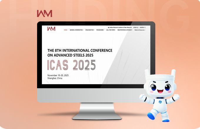
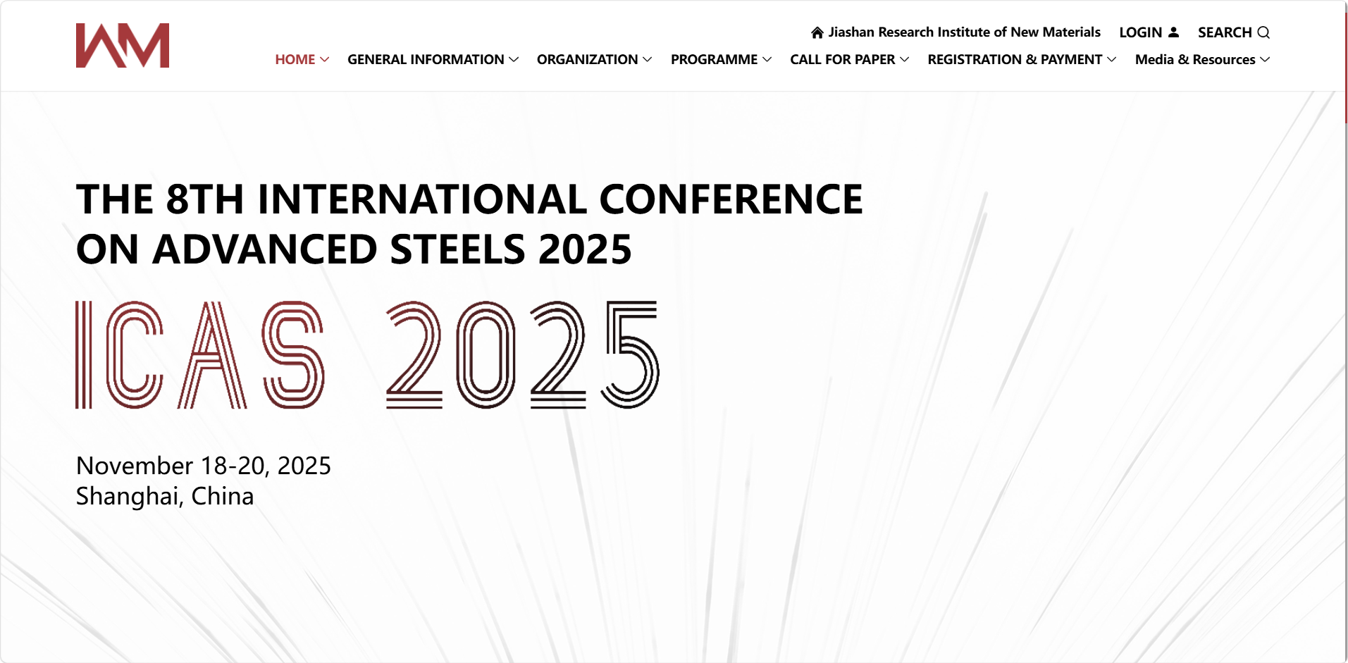

Website Design Description
Using low-saturation red (brand identity color), gray, and white as the main palette, matching the rational character of research institutions while strengthening institute recognition through brand color reuse.
Clean sans-serif fonts convey the professional, rigorous, academic, and pragmatic research tone, fully expressing the hardcore quality of materials science.
Using card/section layout, technology, news and other sections presented as title + short description + scene image, with clear information hierarchy, matching the habit of researchers to quickly access professional content.
The M logo appears repeatedly in navigation, footer, and real-scene images, creating visual continuity, naturally blending brand elements with research scenarios, strengthening memory points.

Results Display
(1) Multi-device Adaptation
Responsive layout, PC/mobile scenarios both adaptable, office and mobile scenarios both maintain stable connections.
(2) Efficient Operation Support:
Complete functional modules, convenient backend operations, rapid after-sales response, reducing maintenance costs;
(3) Brand Recognition Improvement:
Brand color scheme + all-scenario M logo, strengthening the institute professional image memory.

With 13 years of project management experience, I can offer you professional advice.

 400-658-2885
 service@shhuding.cn
 400-658-2885 service@shhuding.cn
CopyRight 2013-2026 Copyright © Shanghai Huding Information Technology Co., Ltd. and/or its affiliates. All rights reserved. Legal action will be taken against any counterfeiting. Shanghai ICPFiling 19021046No. -1